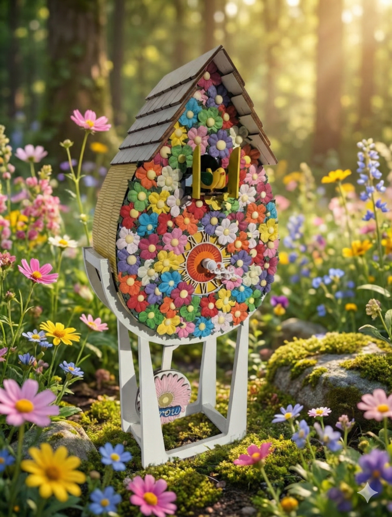
The Inspiration: More is More
If the “Bloom” clock is a gentle spring morning, this clock is high noon in the middle of July.
For this piece, I wanted to push the boundaries of texture. I didn’t want a background color with flowers on it; I wanted the flowers to be the background. I wanted to create a “living wall” effect where the wood disappears beneath a canopy of petals.
The Design: A Mosaic of Color
This is the most intricate face I have ever assembled.
- The Density: Hundreds of individual wooden flowers—daisies, cosmos, and zinnias—are puzzled together to create a solid surface of color. There is no negative space here. It’s a riot of red, purple, blue, and yellow that feels almost like a coral reef or a wildflower meadow.
- The Contrast: Because the face is so busy, I kept the roof a crisp, clean white and the pendulum a simple, modern white disc. This balance keeps the piece from feeling chaotic; it frames the explosion of color in a modern structure.
- The Sides: I carried the energy to the sides with a bright, sunny yellow texture, ensuring the clock looks vibrant from every angle in the room.
Why It Stands Out
This clock isn’t for a quiet corner. It’s a centerpiece. It captures that feeling of walking through a field where the flowers are so thick you can’t see the ground. It’s bold, it’s loud, and it’s unapologetically happy.